Our Brand, Leicester Museums & Galleries
Published: 17 August 2020
Leicester Museums & Galleries has a portfolio of unique sites which provide an authentic experience for visitors and contribute towards shaping the city’s character and identity as a cultural and social mosaic.
The city’s significant collections are eclectic and document the natural world, tell Leicester’s 2,000-year story and celebrate the cultures of its modern citizens.
Promoting the city’s heritage helps us to celebrate our past, benefit the present, and create a better future. Leicester’s residents can be proud to live in an historic place, which is at the same time a modern, cosmopolitan city where so many different communities live and work together. Our role is to create exceptional visitor experiences and to care for and share these collections, making them accessible to a wide audience.
As part of this mission we’ve developed a distinctive new brand identity. The logo for each of the six sites reflects each museum’s characteristics, but are also recognisable as one of the ‘family’ of six sites so that each individual museum helps to build recognition of the other five.
Our new identity will drive us forward to make Leicester Museums & Galleries more inclusive and engaging, belonging to the city’s communities, and a source of pride and inspiration.
Mosaic Arrow
Mosaic tiles are featured across all museums in our portfolio. Each singular piece of mosaic is unique and hand-made, combining art, craftsmanship and sculpture.
Our brand identity uses the mosaic arrow as a metaphor for the rich and colourful tapestry of our museum’s collections.
When each piece of mosaic, all different in colour and tone, is brought together and assembled, they are beautiful, but more importantly they begin to tell a story.
Working together, they are stronger – the whole is greater than the sum of its parts.
Leicester Museums & Galleries logo
Our brand identity
The Leicester Museums & Galleries logo has been created using a combination of logo type and logo mark, it is the overarching identity that pulls all of our destinations together to create a family.
The primary logo has been created using an individual piece from each of the six destinations in our portfolio, each colour has been used to create the combined logo mark.
Our museums
Leicester Museums & Art Gallery logo
The four mosaic arrows are a visual representation of the Leicester Museum & Art Gallery being the central hub of our portfolio and the city’s flagship museum.
The arrow reflects the architectural shape of the pediment on the front facade of the museum buildings whilst the four arrows represent the four corners of a picture frame - this being the only Art Gallery in the portfolio.
We have reprised the old name of Leicester Museum & Art Gallery (formerly New Walk Museum & Art Gallery). The New Walk Museum name, has only been a brief part, for 23 years, of the museums 171 year history, becoming New Walk Museum only in 1997.
Since it's founding the museum has been know as:
- 1849 - Town Museum
- By 1888 - Leicester Museum
- By 1944 - Leicester Museum & Art Gallery
- By 1974 - Leicestershire Museum & Art Gallery
- By 1997 - New Walk Museum & Art Gallery
- By 2020 - Leicester Museum & Art Gallery
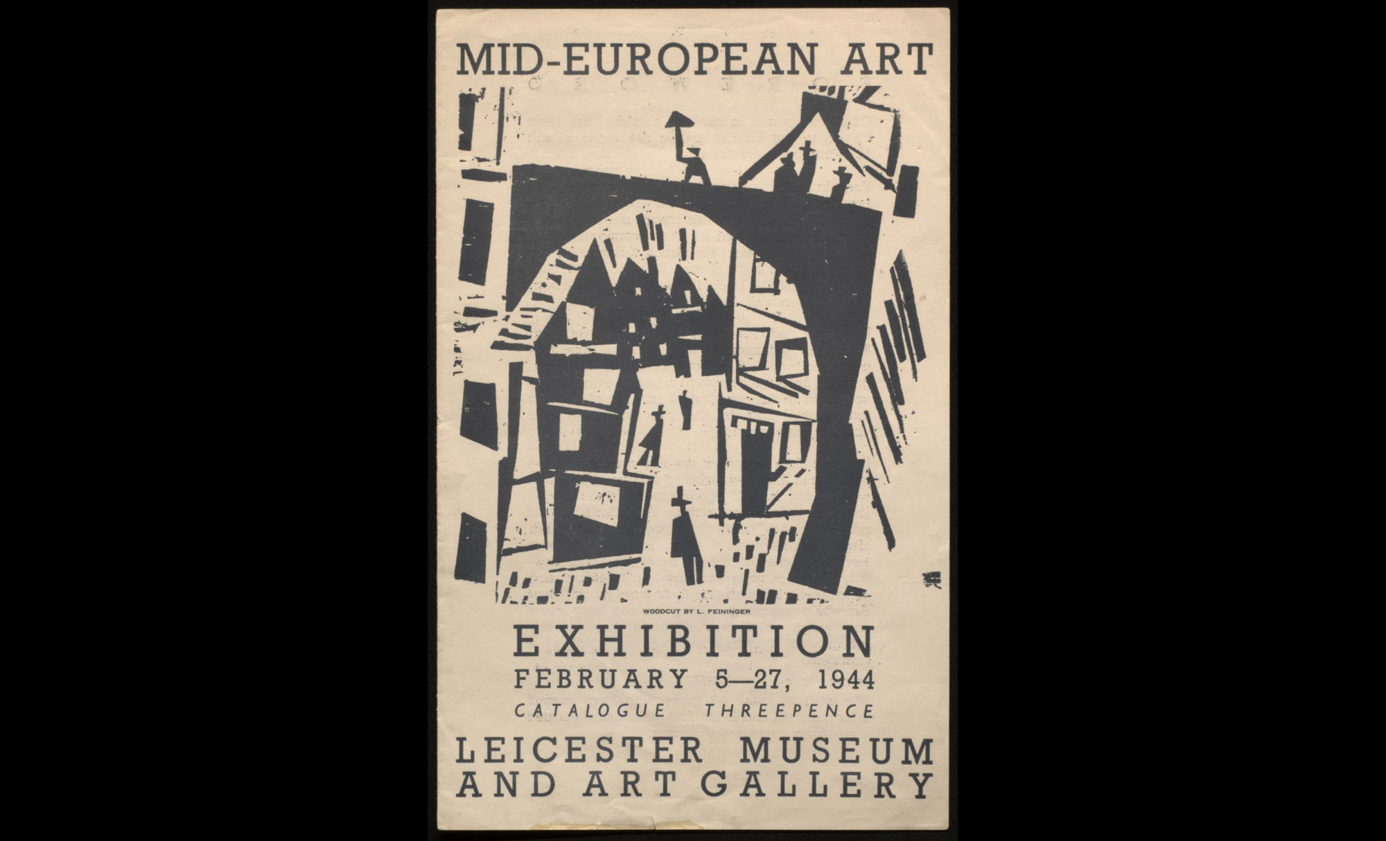
Mid-European Art catalogue
Reverting back to the original name, it places the museum rightfully into its historical context as the flagship museum for the city. This provides geographical knowledge for prospective visitors from outside of the city, with the new tagline also keeping the local context of New Walk - Leicester’s gem in the heart of the city. Leicester Museum & Art Gallery also saves confusion between the previous names of two of our museum’s sites ‘New Walk’ and ‘Newarke’, with visitors often travelling to the wrong site.
Leicester Guildhall logo
The Guildhall logo is made up of a series of eight mosaic arrows which reflect the eight gables of this iconic, medieval building.
The Great Hall is the main feature - constructed with two timber framed gable ends, and has two sets of three window gables along each side.
The logo icon also resembles other religious iconography closely related to the Guildhall - most obvious of which is a medieval crown.
The Leicester Guildhall is one of the oldest buildings in Leicester and has a very close proximity to the King Richard III Visitor Centre and Leicester Cathedral. It benefits from visitor traffic from both of those locations and therefore needs to stand apart from them with a bold distinctive and recognisable logo.
By changing the name of the Guildhall to the Leicester Guildhall we have given a geographical distinction between our Guildhall and others around the country.

Taking inspiration from traditional Roman mosaic tiles which have been discovered here in Leicester. The Jewry Wall logo is built up from the simple half block tile which reflects the decorative and stylised designs typical for that period of Roman history.
The design also has a heraldic look-and-feel, with outwardly facing points that represent the advancement in geographical wayfinding which the Romans pioneered.
Jewry Wall is one of the tallest surviving pieces of Roman masonry in Britain it houses a unique collection of Iron Age, Roman and Medieval Leicester artefacts.
By changing the name from simply Jewry Wall and adding ‘Roman Centre of Britain’ we have proudly made it a historically significant destination not just nationally but internationally also, as part of the site’s major refurbishment.
Abbey Pumping Station logo
One of the most prominent features of the Abbey Pumping Station is the magnificent red brick octagonal chimney which can be seen from miles around.
This icon has been developed into a similar octagonal shape to represent that design with a birds-eye-view of this historic chimney which features a decorative, ornate chimney crown.
Abbey Pumping Station was formerly named as a museum of Science and Technology we have renamed it to Leicester’s Industrial Museum which gives a better representation of the attractions on offer.
By changing the name it also gives Abbey Pumping Station a sense of ownership over Leicester’s wider industrial history.
Newarke Houses logo
The Newarke Houses logo has been formed to reflect the three iconic gables at the front of this unique, and historical buildings. The three inverted shapes below them represent UK service stripes, or rank insignia. Three diagonal stripes commonly indicate Sergeant, or equivalent. This approach helps to identify the important regimental offering at the Museum.
Newarke Houses is home to The Royal Leicestershire Regimental Museum and one of the museums main attractions. As such the logo as been created to reflect not just the uniqueness of the buildings architecture but also it’s rich military heritage as well.
Belgrave Hall logo
Belgrave Hall gardens are only open during the summer months and display two acres of serene walled gardens, so the logo has been fashioned into a simple image which combines a flower and sunshine rays.
Belgrave Hall is from the Queen Anne period and this motif also resembles the Queen Ann style mosaic pattern seen on tiles at the Hall.
Belgrave Hall is a Queen Anne-style Grade II listed building and required a logo that matched the ornate style represented thought the building and the beautiful gardens.
For use of the Leicester Museum & Galleries or individual site branding and logos, please contact James Hickford, Senior Communications & Marketing Officer.